Choosing paint colours can be a daunting task, especially when considering the unique light and climate of Perth. The city experiences an abundance of sunshine and a Mediterranean climate, which can impact the perception of colours. VJC Painting, specialists in luxury residence and commercial painting, understands the challenges of selecting the perfect palette. Their expertise is particularly sought-after by restaurant owners in Gosnells, who are looking to refresh their dining areas and commercial kitchens, as well as homeowners preparing their properties for sale. In this guide, VJC Painting shares its insights on how to choose colours that will thrive in Perth’s environment and create a seamless flow between indoor and outdoor spaces.
Understand the Psychological Effects of Colour
When selecting paint colours, it’s essential to consider the psychological effects that different hues can have. Colour can influence mood, appetite, and even productivity. For example, warm colours like reds and oranges can stimulate conversation and energy, making them ideal for social spaces like dining areas. On the other hand, cool colours such as blues and greens promote calmness and relaxation, perfect for creating a tranquil atmosphere in bedrooms or spas. Neutral colours, including greys and beiges, offer versatility and a sense of sophistication, often favoured in commercial spaces and luxury residences. Understanding the psychological impact of colours can help you curate a palette that aligns with the desired ambiance of each space.
Consider the Abundant Natural Light in Perth
Perth is renowned for its sunny days and clear skies, with an average of over 3,000 hours of sunshine annually. This abundance of natural light can make colours appear brighter and more vibrant. When selecting paint colours, consider the direction of the room and the quality of light it receives. North-facing rooms in the southern hemisphere tend to receive warm, flattering light, while south-facing rooms have a cooler light that can wash out colours. East-facing rooms capture the soft morning light, and west-facing rooms are bathed in warm afternoon sunshine. Taking these light qualities into account will help you choose colours that complement the natural lighting conditions and avoid colours that may appear too harsh or washed out.
Create Seamless Transitions Between Indoor and Outdoor Spaces
Creating a seamless flow between indoor and outdoor areas is a popular design trend, especially in Perth’s climate, which encourages alfresco living. To achieve this, consider using similar colour families or complementary palettes for both spaces. For instance, you could extend the indoor colour scheme onto an outdoor feature wall, blending the two areas together. Alternatively, use colours that echo the natural environment, such as earthy tones that reflect the surrounding landscape or shades of blue that evoke the sky and ocean. This harmonious connection between indoor and outdoor spaces enhances the sense of space and brings a feeling of unity to the entire property.
Choose Durable Paints for Commercial Kitchens and High-Traffic Areas
In commercial kitchens and high-traffic areas, such as those found in restaurants and busy residences, it’s crucial to select durable paints that can withstand frequent cleaning, steam, and general wear and tear. Opt for high-quality, scrubbable paints with a durable finish, such as semi-gloss or satin. These finishes are easier to clean and more resistant to stains and marks. Consider using eggshell or low-sheen finishes in areas that require some level of washability but also need to minimise glare and hide minor surface imperfections. Choosing the right paint finish will ensure that your colour choices remain vibrant and durable, even in the most demanding environments.
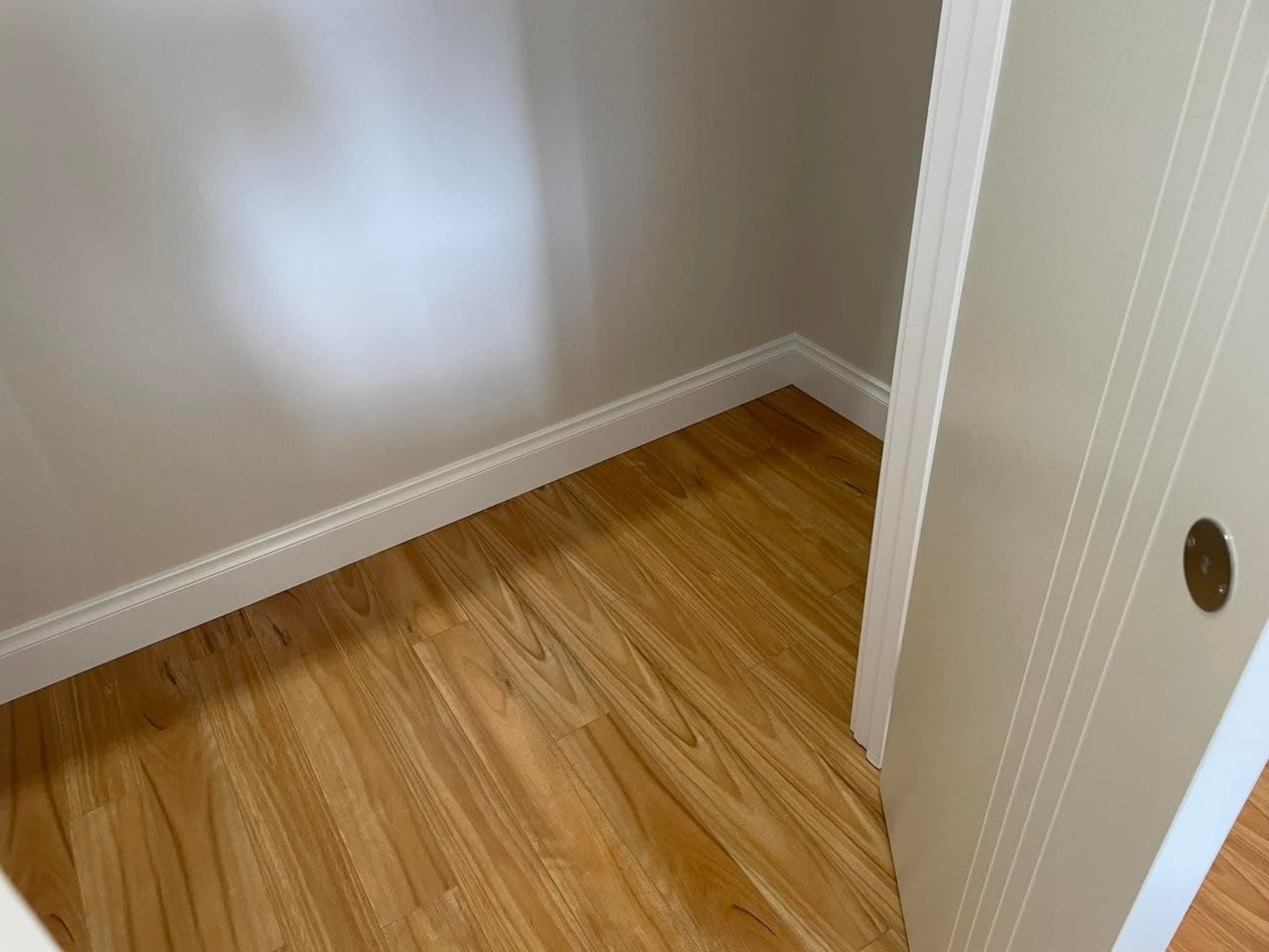
Prepare Your Property for Market with Neutral Colours
If you’re preparing a property for sale, it’s generally advisable to stick to neutral colours. Neutral tones create a blank canvas that appeals to a wide range of potential buyers, allowing them to envision their own style within the space. Neutral colours also convey a sense of spaciousness and calm, making the property feel inviting and homely. However, this doesn’t mean that your palette has to be boring. Experiment with different shades of neutrals, from warm beiges to cool greys, and add interest through textures and subtle feature walls. Remember that the exterior of the property is equally important, so choose colours that enhance the curb appeal and complement the surrounding neighbourhood.
FAQs
How does the Perth climate impact paint colour choices?
Perth’s Mediterranean climate, characterised by warm to hot, dry summers and cool, wet winters, can affect the durability of paint. Opt for paints that can withstand these varying conditions. The abundant sunshine also influences the perception of colours, making them appear brighter and more vibrant.
What colours work well in Perth’s unique light?
Perth’s clear, sunny skies can make colours appear more intense. Consider using softer shades or neutral tones to avoid an overwhelming effect. Warm colours like terracottas and soft blues are a perfect choice for reflecting the city’s sunny disposition.
How can I create a cohesive colour scheme between indoor and outdoor areas?
Use similar colour families or complementary palettes for both spaces to create a seamless transition. Reflect the natural environment with earthy tones or shades of blue. This unifies the spaces and enhances alfresco living.
What paint finishes are best for commercial kitchens and high-traffic areas?
In these areas, durability and washability are key. Opt for semi-gloss or satin finishes, which are easy to clean and resistant to stains. Eggshell or low-sheen finishes offer a balance between washability and a softer, less glossy appearance.
How can I enhance the curb appeal of my property with paint?
Focus on creating a cohesive colour scheme that complements the surrounding neighbourhood while also highlighting the unique features of your property. Use colours that emphasise architectural details and consider a feature front door colour to create a memorable first impression.
Key Information
| Topic | Details |
| — | — |
|---|---|
| Natural Light | Consider the direction of the room and the quality of light it receives to choose flattering paint colours. |
| Indoor-Outdoor Flow | Create unity with similar colour families or echo the natural environment. |
| Commercial Durability | High-traffic areas require scrubbable, durable paints with semi-gloss, satin, or low-sheen finishes. |
| Market Preparation | Neutral colours appeal to a wide range of buyers, adding a sense of spaciousness and calm. |
| Colour Psychology | Warm colours stimulate, cool colours soothe, and neutrals provide versatility. | | Natural Light | Consider the direction of the room and the quality of light it receives to choose flattering paint colours. | | Indoor-Outdoor Flow | Create unity with similar colour families or echo the natural environment. | | Commercial Durability | High-traffic areas require scrubbable, durable paints with semi-gloss, satin, or low-sheen finishes. | | Market Preparation | Neutral colours appeal to a wide range of buyers, adding a sense of spaciousness and calm. |
Choosing the right paint colours for your Perth property involves careful consideration of the region’s unique climate and lighting conditions. By understanding the psychological effects of colour and how it interacts with Perth’s abundant natural light, you can create beautiful, functional spaces. Seamless transitions between indoor and outdoor areas enhance the liveability and visual appeal of your home or commercial venue. With VJC Painting’s expertise, you can make informed colour choices that will transform your space and thrive in the Perth environment.
Contact VJC Painting today to discuss your unique painting project and benefit from their colour consultation expertise. Together, you can create a cohesive and stunning colour scheme that captures the essence of Perth’s vibrant yet relaxed lifestyle.
These articles are drafted with AI assistance and should be considered general information not professional advice or information Learn More