Introduction:
When it comes to creating a welcoming environment for tenants and guests in Perth, the exterior colour scheme plays a vital role. The right colours and finishes can enhance the curb appeal and create a lasting impression. In this article, we’ll explore the most popular exterior colour schemes in Perth and how they can be used to transform rental properties and accommodation businesses. We’ll also discuss the impact of colour on lighting and ambiance and provide tips on creating modern and inviting spaces. Whether you’re a property investor or in the hospitality industry, these insights will help you make informed decisions about your next painting project.
Perth’s Favourite Exterior Colour Schemes:
Soft, Neutral Tones:
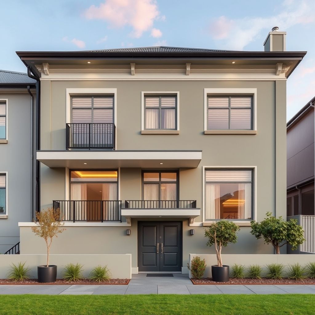
Perth is known for its sunny disposition, and this is reflected in the city’s preference for soft, neutral colour palettes. Colours like beige, cream, and taupe are popular choices for exterior walls, as they create a warm and inviting ambiance. These colours also provide a versatile backdrop that can complement a variety of design styles and landscapes. By opting for neutral tones, you can easily update the look and feel of the property with minimal changes, making it appealing to a wider range of tenants or guests.
Coastal-Inspired Blues:
With Perth’s stunning coastline and beach culture, it’s no surprise that coastal-inspired colours are a popular choice. Shades of blue, from pale aqua to deep navy, can be found on many exterior walls throughout the city. These colours evoke a sense of calm and serenity and are often paired with white trim for a crisp, clean look. Coastal-inspired colour schemes are particularly effective for properties near the beach or those wanting to create a relaxed and tranquil environment.
Enhance Natural Lighting:
Strategic Colour and Finish Choices:
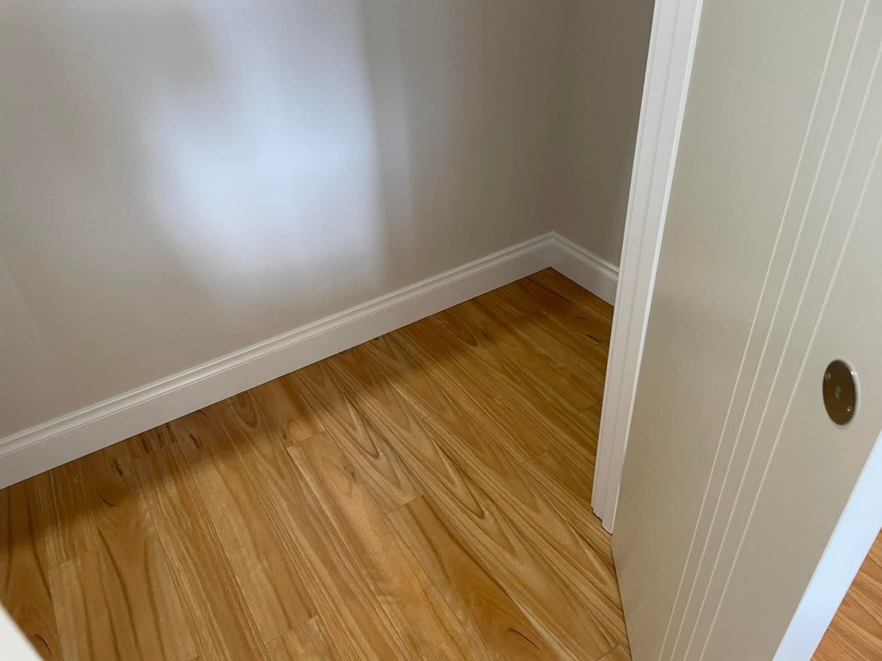
The right colour and finish choices can significantly impact the lighting and ambiance of a space. Lighter colours, such as pale grey or linen, can help bounce natural light around a room, making it feel brighter and more spacious. On the other hand, darker colours can create a cosy and intimate atmosphere. Consider the direction of natural light and the finish of the paint, as gloss or semi-gloss finishes can further enhance lighting by reflecting light. For accommodation providers, this is especially important in guest rooms and common areas to create a bright and welcoming atmosphere.
Accentuate with Feature Walls:
Feature walls can be used effectively to enhance lighting and create a focal point. In rooms with limited natural light, a feature wall painted in a light, reflective colour can brighten up the space. Alternatively, a dark and dramatic feature wall can add depth and character to a well-lit room. Consider the use of metallic paints or specialty finishes to further amplify the impact of feature walls and enhance the lighting design.
Create a Modern Ambiance:
Embrace Simplicity:
Modern colour schemes often embrace simplicity and minimalism. Monochromatic colour palettes, such as varying shades of grey or beige, can create a sleek and sophisticated look. This approach allows the architecture and design features to take centre stage while still providing a cohesive and stylish exterior. For property investors targeting a modern demographic, this colour scheme can be a drawcard.
Incorporate Natural Elements:
Bringing the outdoors in is a popular design trend, and this can be achieved through colour choices. Earthy tones, such as muted greens, browns, and terracotta, can create a connection to nature and add a sense of warmth to a space. This colour scheme is particularly effective when paired with natural materials like timber and stone. Consider this approach to create a relaxing and organic ambiance for tenants or guests.
FAQs:
How do I choose a colour scheme that appeals to most tenants or guests?
Neutral colour palettes are a safe and popular choice as they cater to a wide range of tastes. Lighter neutrals can make a space feel brighter and more spacious, while darker neutrals add sophistication and warmth. Coastal-inspired colours are also a safe bet in Perth due to the city’s beach culture.
Can colour help enhance the perception of space?
Absolutely. Lighter colours and neutral palettes can make a space feel more open and spacious. Using the same colour throughout an area, including walls, trim, and even furniture, creates a seamless and expansive look. This is especially effective in smaller rooms or areas with limited natural light.
How do I create a cohesive look throughout the property?
A cohesive look can be achieved by using a consistent colour scheme and repeating colours or finishes in different areas. For example, using the same accent colour on exterior walls, doors, and trims can tie the whole property together. Consider using a colour wheel to identify complementary or analogous colours for a harmonious look.
What finish should I use for exterior walls in Perth’s climate?
Perth’s climate is known for its warm, sunny days and mild winters. A gloss or semi-gloss finish can be a great option for exterior walls as it reflects light, making the colour appear brighter and more vibrant. These finishes are also easier to clean and can withstand the city’s weather conditions.
How can I make a bold colour choice work for my property?
Bold colours can be used effectively as a feature or accent. Consider pairing a bold colour with neutrals to create a balanced look. For example, a deep teal door against a light grey exterior can add a pop of colour and visual interest while still appealing to a range of tastes.
Key Information:
| Colour Scheme | Benefits |
| — | — |
|---|---|
| Coastal-Inspired Blues | Evokes a sense of calm and serenity, perfect for beachside properties |
| Light and Bright | Enhances natural lighting, makes spaces feel larger |
| Modern Monochromatics | Sleek, sophisticated, showcases design features |
| Earthy Tones | Creates a relaxing, organic ambiance, connects to nature |
| Soft, Neutral Tones | Warm and inviting, versatile, easy to update | | Coastal-Inspired Blues | Evokes a sense of calm and serenity, perfect for beachside properties | | Light and Bright | Enhances natural lighting, makes spaces feel larger | | Modern Monochromatics | Sleek, sophisticated, showcases design features | | Earthy Tones | Creates a relaxing, organic ambiance, connects to nature |
Conclusion:
Choosing the right exterior colour scheme involves understanding the impact of colour on lighting and ambiance and considering the latest trends. By embracing Perth’s preference for soft, neutral tones and coastal-inspired colours, you can create welcoming environments that cater to a range of tastes. Enhancing natural lighting through strategic colour and finish choices can further elevate the appeal of your property. Whether you’re a property investor or in the accommodation industry, these insights will help you transform your space and create a positive first impression.
If you’re preparing a rental property or accommodation business for new tenants or guests and need assistance with colour selection and painting services in Perth, contact VJC Painting today. Our expert team can guide you through the latest trends and help you create a beautiful and inviting space. Let’s work together to transform your property and create a lasting impression.
These articles are drafted with AI assistance and should be considered general information not professional advice or information Learn More